




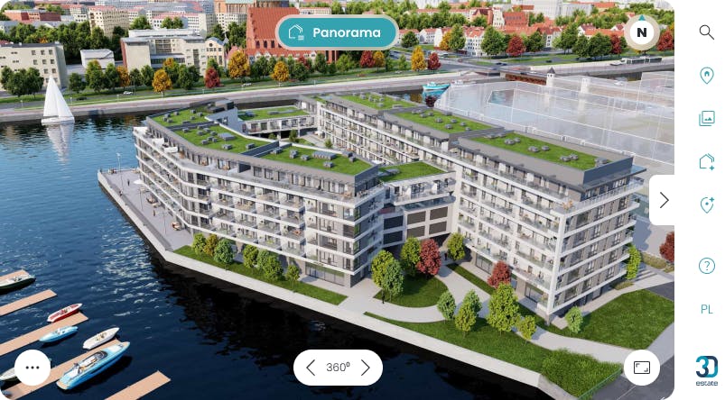
What Is an Interactive Site Map for Multifamily?
What the data shows after 2,000 delivered projects


Renters now shop for an apartment the way buyers shop for a home. They start online, they self-qualify before they ever call, and they expect to see exactly what is available right now. By the time a prospect reaches your leasing office, they have usually already decided which two or three communities are worth a visit.
That is a problem for the way most multifamily websites still present a property. A flat site plan PDF, a grid of stock amenity photos, and a "check availability" form answer almost none of the questions a renter is actually asking. Which units face the courtyard instead of the parking deck? What is open on a high floor right now? What does the view actually look like from a corner one-bedroom? Without answers, the prospect leaves, or your leasing team spends the call delivering information a website should have handled.
An interactive site map closes that gap. Below is what it is, the different levels of "interactive" you will run into, and how to tell a genuine leasing tool from a clickable picture.
What an interactive site map actually is
An interactive site map for multifamily is a clickable, digital map of a rental community that shows real-time unit availability, pricing, floor plans, and amenities, and lets a prospective renter explore the property and filter to the right apartment online, before they contact the leasing office.
The key word is interactive. A prospect does not just look at it. They click a building, see which units are available, filter by bedrooms, price, or floor, open a floor plan, look at the view, and shortlist the apartments worth touring. Good ones connect to your property management or CRM system, so the availability and pricing a renter sees online match what your leasing team sees internally.
In other words, it is less a map and more a self-service front end for your leasing inventory.
What an interactive site map is not
The term gets stretched, so it helps to draw clear lines.
It is not a static site plan. A PDF or image of your community layout, even a pretty one, cannot show live availability, cannot filter, and goes out of date the moment a unit leases.
It is not a virtual tour. A 360 photo tour or a Matterport scan walks a renter through one finished space. It is useful, but it requires the unit to physically exist, and it does not show availability or pricing across the whole community. A site map answers "which apartment," a tour answers "what does this one apartment feel like." They solve different jobs.
It is not an ILS listing. Apartments.com, Zillow, and similar listing services drive traffic, but they present your community inside a standardized template you do not control, alongside every competitor on the page. A site map lives on your own property website and keeps the prospect in your experience.
It is not a plain map widget. A pin on a Google Map shows where the community is. It says nothing about what is inside it.
The interactive site map maturity spectrum
Most confusion in this category comes from treating "interactive site map" as one thing. It is really a spectrum of fidelity, and the differences matter a lot for how renters respond and how much the tool actually helps your leasing team.
<tabelka>
The honest takeaway: there is no single right level. A small, stabilized garden-style community may be well served by a Level 2 map. A new high-rise lease-up, a build-to-rent community, or any property where the view and the building experience are part of what you are selling will usually get far more out of Level 3, because the questions renters care about most are spatial, and a flat map cannot answer spatial questions.
The parts that make an interactive site map work
Whatever the fidelity, the same components separate a useful tool from a decoration:
- Unit-level availability, accurate to the apartment, not just "we have one-bedrooms."
- Real-time sync with your property management system or CRM (Yardi, RealPage, Entrata, or a custom stack), so what renters see matches what is actually open and priced. A map that shows an apartment that leased last week does more harm than no map at all.
- Pricing, shown clearly and kept current through that same sync.
- Filtering and comparison, so a prospect can narrow by bedrooms, price, floor, or exposure and put two units side by side.
- Floor plans tied to each unit, ideally switchable between 2D and 3D.
- Real views and orientation. What you see from the unit should reflect its actual floor, direction, and sightlines, not a generic render reused across the building.
- Amenities and points of interest, so the pool, gym, co-working lounge, and dog park are part of the story.
- Mobile performance. The large majority of property-site traffic is on phones. If it is slow or needs an app, you lose people.
- On-site mode. The same map should run on a touchscreen or tablet in the leasing office, so the online and in-person experience are continuous.
- Analytics and follow-up. You should be able to see what a prospect viewed and send them a link to the specific units they shortlisted.
If you remember one thing from this list, make it the sync. Live, accurate availability is the difference between a sales tool and a liability.
Common mistakes that make interactive site maps underperform
The technology rarely fails. The implementation does, almost always in one of these ways:
- It is buried. If finding the map takes three clicks, most renters never see it. It should be the first thing on the property page, not a footer link.
- Coverage is partial. Modeling only a few "showcase" units to save scope signals to renters that you are hiding the rest.
- Availability is stale. A map that is not synced will eventually show a leased unit as available, which erodes trust faster than having no map.
- It is desktop-only or slow. Built for the sales-office monitor and never tested on a phone, it loses the majority of traffic.
- There is no follow-up loop. If a consultant cannot send a prospect the units they shortlisted, you have left the most valuable moment on the table.
The fix in every case is to treat the site map as leasing infrastructure, owned and measured like the rest of your funnel, rather than as a marketing flourish added at launch.
Where full-3D platforms fit
This is the part of the spectrum we work in. 3D Twin builds photorealistic, fully interactive 3D models of residential communities from the architectural data, with unit-level availability, real views from each apartment's actual floor and orientation, day and night lighting, filtering and comparison, and a leasing-office mode for on-site use. Because it is generated from plans, it can be live before a building is finished, which is why it tends to fit new construction, high-rises, and build-to-rent lease-ups.
For context on scale rather than as a pitch: we have delivered 2,000+ projects for 400+ residential clients across 18 countries, and a community model typically goes from plans to live in about eight to ten weeks. Whether you need that level of fidelity depends on your asset. A stabilized garden community may not. A view-driven lease-up almost certainly will.
The takeaway
An interactive site map is not a nicer picture of your community. It is the part of your website that does the work a leasing consultant used to do alone: showing a renter what is available, helping them choose, and handing your team a warmer, better-qualified prospect. The question is not really whether to have one. It is which level of fidelity your asset and your lease-up actually need, and whether the one you choose is synced, complete, mobile, and easy to find.
The best way to judge that is to see one running on a real community rather than in a slide. You can request a demo at 3dtwin.com.
The Next Five Years in Residential Sales
The expectation of interactive, mobile-first access to property information is now set by industries with far larger development budgets than real estate. Buyers who configure cars, furniture, and consumer electronics in full 3D before purchasing will not find a static floor plan PDF to be a satisfying substitute for a residential purchase an order of magnitude larger.
Developers who build digital twin capability into their standard launch process now are building institutional knowledge, not just deploying a tool. The teams who have used this in two, five, ten launches understand how to deploy it faster, position it in buyer conversations, and read the analytics it generates. That institutional knowledge compounds.
The technology itself will continue to evolve. The question for a developer is not whether this becomes standard practice. The question is whether they are building that capability now or paying to catch up later.
If you want to see exactly what this looks like for a residential project at your scale, we are available for a direct walkthrough of the platform. No presentation deck. The application itself, on a live project.
Request a demo at 3destate.com.

3D Twin — investment BPI Real Estate - Bernardovo

Czytaj podobne
Industry
How 3D Virtual Tours Transform Real Estate Marketing: Data, Trends, and Proven Results

Industry
Digital Twin Technology for Residential Development
What the data shows after 2,000 delivered projects
Industry
Innovation and Automation: How 3D Estate Is Reshaping the Rules of Real Estate Marketing and Sales